Tuesday, July 19, 2011

Laine Grace

Just finished a painting last week for a precious new baby girl who will make her debut in August! I love the name Laine Grace.....just precious. She will be joining 2 big sisters!! I have not ever met this mom, and have only spoken with her on the phone. This painting coordinates with the Harlington Bedding from Pottery Barn Kids. Lots of pinks, reds, and a hint of orange and turquoise. The request was made to focus on pink, red, and white! This one was another really big one- 2ft by 4ft!

The pictures of the overall completed canvas never turn out very well on a canvas this big. You can't really grasp what it looks like in person. The flowers were part of the bedding. The swirlies on the left and the dots in the frame were extra that I added in just because. I liked the extra character is gave the canvas!


The design wrapped around the wide edges of the canvas


I had to throw in a few dots of turquoise and orange just to bring out the color in the bedding! Nothing too much......just a smidge:)


I had a really hard time deciding on a color for the font on this one. I actually did the entire name in turquoise, only to stand back from it and not really like it! It just didn't go. So I went over it in red. It needed something more. Or different. So I tried going over it in the coralish pink color, and when I decided that wasn't quite right either, I went to wipe it off with a baby wipe and voila- I ended up with a really good highlight! I was pretty happy with this and so that's how the font became colored red with pink highlights. Rachel- I hope this looks good in the nursery and that it's exactly what you wanted!

Thursday, June 30, 2011

Bowen's Painting

Painting done for baby Bowen, born to Bradley and Cammie! The bedding had supercute dots, but no other pattern than that. Lots of different colors. I went with solid chocolate brown dots around the outside, and used the other colors for stripes in the middle section.


Love how the red pops in the middle!


some highlighting in the stripes and dots


supercute font!


three frames


Monday, February 28, 2011

I've Been Busy.......

I have to say first off that these pictures are HORRIBLE!! I sent these home with my friend last night and then realized I hadn't taken pictures of them yet, and didn't want them going out the door without taking them, so I did a quick (really bad) job!! Yikes! They don't accurately show color, and some are with the flash and some without, but you'll get the idea. One of my friends in getting married in a few weeks, and she asked me if I would do 12x12 paintings for each of her bridesmaids. They don't know they're getting them. She asked them each what colors they had in their homes, and told me a little about their personalities/style. Other than that, I just had free reign to do whatever I wanted. I know a few of the girls, but the rest I've never met. I love how they turned out. I hope they'll be pleasantly surprised when Angie gives them as gifts!

For this one I was told robin's egg blue and olive green. The color is horrible here, but the diamond pattern is olive and cream, the outside color is blue, and the frame is gold. Font is in chocolate brown.

This one is for a young bridesmaid. She told me purple and zebra, so that's what she got!

This one is for her sweet sister, Amy. Salmon color for the outside, khaki and cream stripes (that I did horizontal this time and really like!!) and chocolate brown font. I accented the curvy khaki frame with some gold.

This one's for her sister-in-law. She told me Brittany's house is very modern, with blacks, whites, and silver and copper. I went with the copper. Love how this one turned out. Very classic.

I don't know this bridesmaid, other than she likes red and gold! Tried a new pattern for the background and absolutely love it! I also really like the font on this one, which is in black paint.

In fact, I liked that pattern so much I used in on this one! I know this sweet bridesmaid. I've done a painting for her daughter's room before! She has rusty orange, sage, and other earthy colors in her living room, so I went with those. The font is in copper, with a dark chocolate curvy border. The outside is very sagey, even though it looks sea-foamy here.

On this one I was told robin's egg blue, red, and khaki. The font is in dark red.

This was the last one I did. I had actually finished it, and hated it so much I trashed it and started over again! And I'm glad I did. I love how this one turned out. She likes red and gold, and that's all I knew. Simple, but really pretty font. I love it!

Kyndal Reese

My cousin, Chelsey, just had her first baby girl a few weeks ago! Kyndal Reese finally joined the world after many years of wanting and praying for a baby. I haven't met her yet, but she is just a doll from the pictures I've seen. I did a painting for her room. Chelsey chose very neutral bedding with creams, whites, and khakis. The bedding has different textures and fabrics sewn together to make the quilt. It's very cute.

Layered look - a frame around the name, and then another around the first print

Picture of canvas with the bedding. You can't tell alot from this though:(

I kept it very soft and simple

She wanted this scripture at the bottom (fitting since she prayed for a long time for this baby!)

Sunday, September 12, 2010

Dane

I recently finished this painting for a friend from childhood. Dane is her second child, and he just came into the world last week! Welcome, baby Dane! Her bedding was a mixture of different fabrics, each tied together with these colors. This is going on a wall that is green and white striped, so I wanted to make the main color the dark blue. This one was pretty detailed!

Her mom requested the scripture to be somewhere on there. I wasn't sure how I was going to make room for it with all of that pattern, but ended up using the vines as a cut-off point to leave the bottom open for lettering.

Here's some of the fabric that I went off of

The stripes on the canvas were not matched to the fabric. The rest of the pattern on the canvas pretty much matched what the fabric looked like, so I wanted to vary it up a little. I hope Ashli and Dane are enjoying his precious nursery!

Friday, July 23, 2010

Hudson Charles

About 10 years ago, I met Sara. We met the summer we both began OT school, in gross anatomy. Sara is funny and witty, and you don't want to get on her bad side.....he he he. Apparently I was the only person whose foot she would touch and not get grossed out by! And believe me when I say we had to palpate/touch/probe...whatever you want to call it.....each other a lot in kinesiology lab. Well, miss Sara has a sweet little girl named Holly, and now she's expecting a little guy in September, who will be named Hudson. I did a painting as a gift for her, and when I asked her if she had any requests, she just said "be creative!". So, here is her painting!
Photo courtesy of Toys R Us website
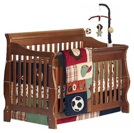
This is her baby bedding. It's Nojo My Little MVP bedding. The colors are super cute together. When I saw it, the things that stood out to me were the plaid and all the stitching (which you can't really see in this picture, but trust me, it's there!).

Her finished painting! I have not yet figured out where in my house or what time of day gives me the best pictures, but believe me when I say the colors matched well. She sent me the valance so I could see them in person.

Instead of doing little baseballs, soccer balls, or footballs, I went with simple green dots around the sides, and mixed up brown stitching inside the dots, then outside the dots. And added some highlights of course!

I used the stitching throughout the painting. It's on the border here, and also frames the box his name is in. I had a challenge with the plaid, making it look like it did in the bedding. In the bedding, it's the same pattern overlaying each other (if that makes sense?), but one is darker than the other. It's sort of transparent. To recreate that, I watered down my paint, then watered it down some more.

Here's the painting up next to the valance. Sara - send me a picture when you get it all together! Can't wait to see it!

Monday, July 19, 2010

Massey Monogam

A friend of ours, Clay, is getting married next month to his sweet fiance, Kristen. We just met her over 4th of July weekend! They seem so perfect for each other! For their shower, I painted a little something small (a 12x12), with their monogram on it. I had NO IDEA what colors they like, but just went with a combination of neutrals that seemed to go together. Their shower was only the 2nd time we'd been around Kristen, and we found out when they opened the gift that these are the exact colors in their wedding!! Crazy!! Sometimes I pray before I start a painting that I will have creative ideas and paint something that will be meaningful and special for the person receiving it. How amazing is that?? She was so happy with it she said they are going to display it somewhere the day of their wedding. What a beautiful gesture! Many many blessings to Clay and Kristen for a long life of joy and happiness together!